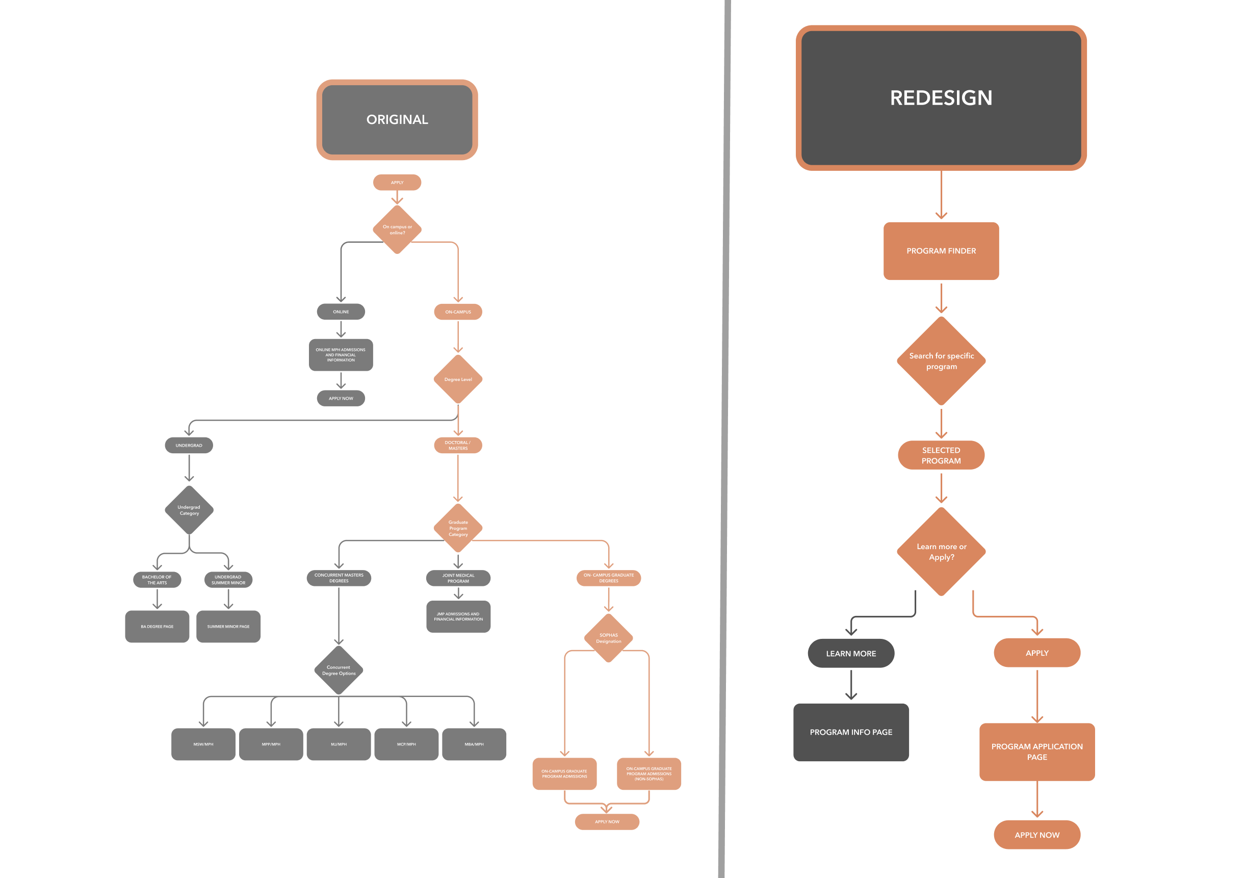
Overview
Simplifying the process for prospective students to learn more and apply to specific programs at UC Berkeley’s School of Public Health.
My Role
I led the end-to-end design of key features, Information Architecture, and final prototypes
Product Design
  • UX/UI Design
  • IA, Wireframing, User Flows
  • Prototyping, Usability Testing
  • Design System
  • Visual Design
Tools
  • Figma
  • Figjam
  • Dovetail
  • Slack
  • Pen & Paper
Status
Developed
Timeline
3 Months
Team
1 Lead Designer
1 Web Developer
Client
UC Berkeley School of Public Health Web Director
Impact
Reduced the number of clicks for students to apply to a program by 50%
In a nutshell 🥜

Problem

Complicated information architecture made it difficult for students to apply to Berkeley Public Health

The existing information architecture of the application flow involved multiple clicks and decisions, which confused prospective students and delayed their ability to determine the correct application path for a particular program.
01

Prospective student browses public health programs

When shopping for different programs, prospective students must search through large catalog of 40+ programs.

- Confusing filters
- Overwhelming information
- No ability to search
02

Student then needs to access program application

To access a programs application instructions, the student must visit a multi-step module upon each consecutive visit.

- Multiple clicks
- Multiple decisions
- Must repeat process
upon every visit

Solution

Consolidating these two flows into a single page simplifies this process and reduces confusion.

In detail 🔎

Discovery

At the beginning of the project, I conducted a heuristic evalutation of the current site, ran a competitive analysis, and met with internal stakeholders to deepen my understanding of the problem.

Stakeholder Interviews

Because there was no budget for user interviews, I started by speaking with the admissions team as they were the closest proxy to prospective students. This helped me better understand the problem.

Identified Users

Prospective Students

Primary users who are searching for information about multiple programs and interested in applying

Current Undergraduate Students

Undergraduate public health students interested in higher education. May be somewhat familiar with the website.

Admissions Team

Concerned with helping students find information and answer specific questions about programs
HMW streamline the Explore Programs and Apply flow to help students quickly locate, compare, and apply to specific programs without confusion?
Stakeholder InterviewsCompetitive AnalysisHeuristic Evaluation

Heuristic Evaluation

A heuristic evaluation was conducted early on in order to assess any usability issues. Once I discovered usability findings, I began to document suggestions for improvement, which I would later present to the client

Competitor Analysis

I created a competitor analysis to better understand how other public health schools approach the problem of multiple programs to organize

Why didn't I interview the students themselves at this stage?

During the beginning of the project, the teams' budget for user research was delayed. For exploratory research, I decided to interview internal stakeholders as a means to better understand the projects needs

Ideation & Iteration

Sketches & Wireframes

Usability Testing

Mid-project, I advocated for user research to hear directly from students. With a newly earned budget for three usability tests, I was able to identify further usability issues in my prototypes and the current website.
Enhanced Navigation & Discoverability
Informed By
Usability Testing
During usability testing, students praised the search bar affordance, the sticky filter menu, and the improved scannability compared to the original.
High Cognitive Load in the Application Page
Informed By
Usability Testing
When tasked with applying to a specific program, students struggled with the redesigned, but still separate “apply” page due to the persistent issue of narrowing application types. While they liked the design, the high cognitive load from excessive decisions and text was a challenge.
Students want to learn more and apply to program in least amount of steps
"If I click apply, I'm ready to apply"
-Usability Test Participant
Informed By
Usability Testing
The apply flow uses terms, often unfamiliar with new students, such as "SOPHAS" or "non-SOPHAS" applications
Final Designs
Updated Homepage
Simplified CTA
"Explore Programs" & "Apply" are now consolidated into one page, simplifying IA  
Program Finder
Simplified filters & Search
Prospective students can now access high-level information more easily, allowing them to make more streamlined decisions

Bookmarks for saving programs

Added bookmarks can help students easily save programs for easy reference upon multiple visits

Mobile Prototypes

Figma Prototype

Takeaways

Further Research Opportunities

If given more time, deeper research into niche user groups such as international students could provide even more tailored improvements

Early-Stage User Research

Due to the lack of exploratory research in the beginning, there were a lot of unanswered questions mid-project that could have been solved with user research. Advocating for and conducting research at the beginning of a project is critical to the design process.