Spokane Watercolor Society Website Redesign
Modernizing and migrating a legacy nonprofit website to keep the organization operational and increase new member signups
TIMELINE
6 Weeks
ROLE
Lead UX/UI Designer
& Web Developer
& Web Developer
Team
President
Web Content Specialist
Tools
Figma
Webflow
Memberstack

Summary
I led the end-to-end redesign and development of a nonprofit website, migrating from Weebly to a scalable, maintainable platform.
Context
2025 I freelanced with Spokane Watercolor Society, a nonprofit community of watercolor artists dedicated to fostering artistic growth and education.
Problem
- The client needed to migrate to a new site builder.
- Site content required manual updates
- membership / ecommerce systems were outdated
- information architecture made navigation difficult.
Impact
+150% increase in new member sign-ups
month-over-month after launch
Client Feedback
“Our members love the new site and are raving about how easy it is to use."
Shipped Product
The redesigned website was successfully shipped in a 6 week timeline
Problem
In 2024, Square announced it would discontinue investment in Weebly. This made it difficult for the client to update and maintain content.
The organization needed a new platform and design just to remain operational.
The website, built years earlier by a former president, contained:
30+ Artist pages, requiring manual updates for both members and client
Unstructured Information Architecture, making navigation difficult
Static site content, making regular updates confusing and frustrating
Project Constraints
- Responsibility to preserve artist pages and identity during migration
- Solo developer & designer
- Need to unify authentication, ecommerce, and content in one ecosystem
- 6 week timeline
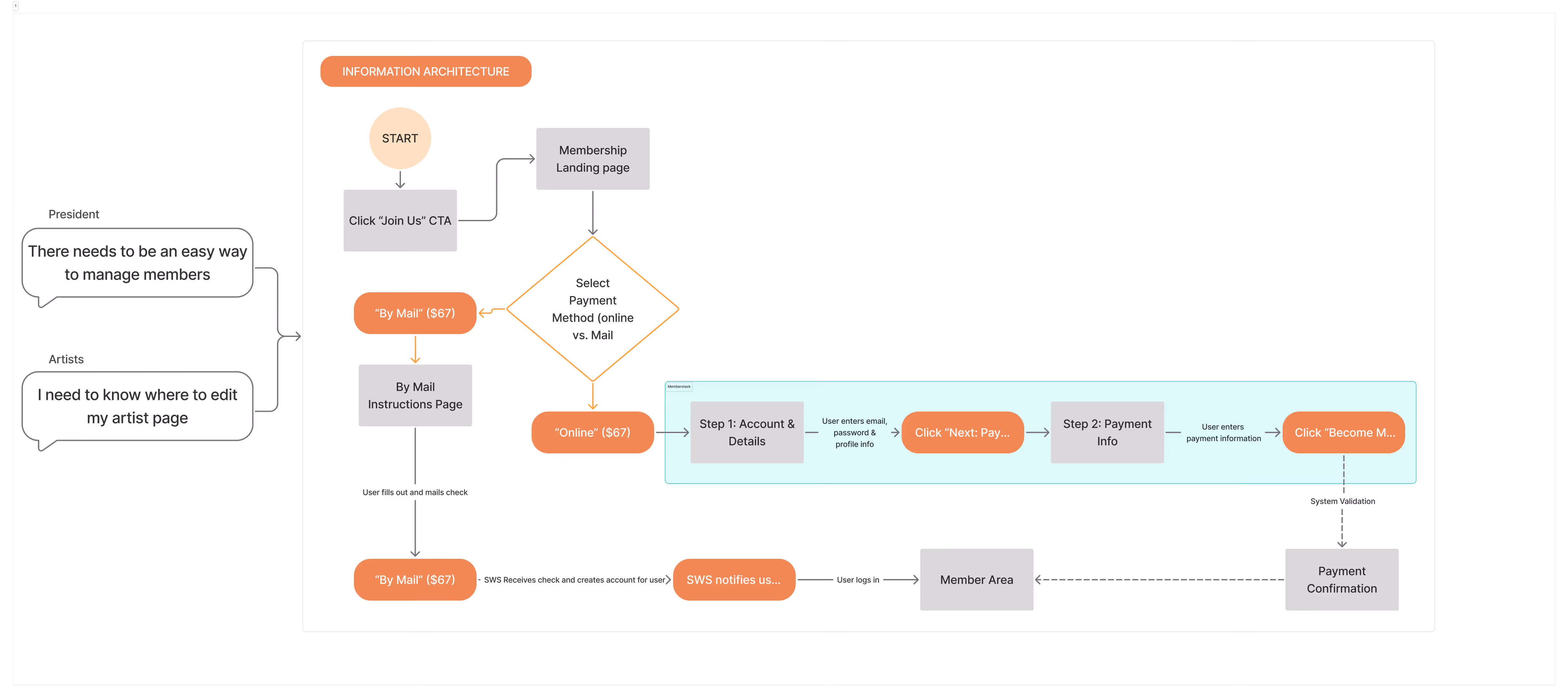
How might we migrate and redesign the SWS website so that a rotating board and 30+ artists can confidently manage content, events, and payments with minimal maintenance?
Solution
I designed & developed three 0-1 primary features for SWS to improve UX, simplify content management, and enhance new member onboarding
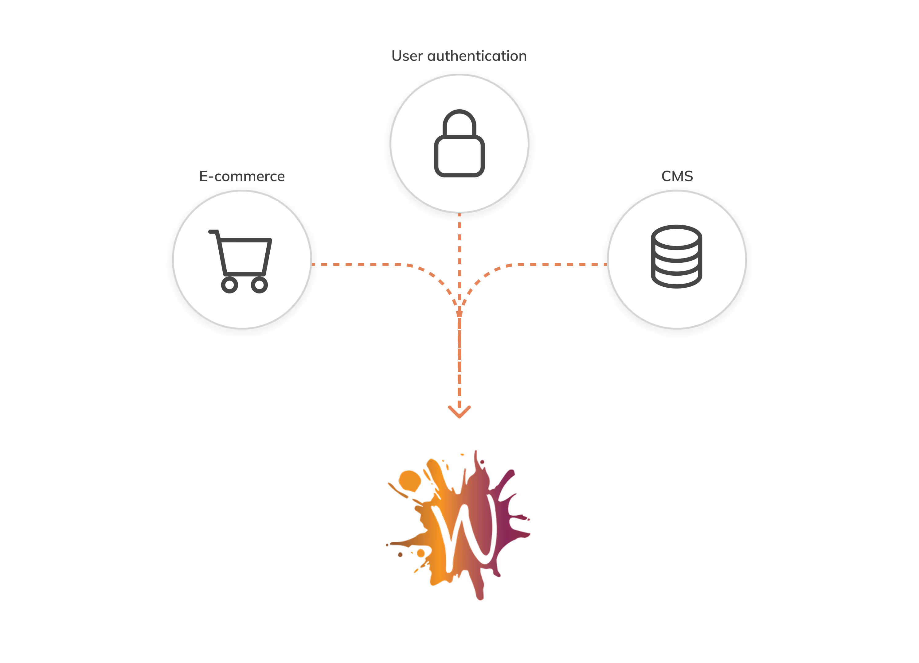
1. System design
Pain Point
Managing memberships, payments, and artist content required multiple disconnected tools, creating manual work and confusion for a rotating, non-technical board.
My Solution
I developed an integrated platform where authentication, e-commerce, and a CMS works together, reducing maintenance and upkeep
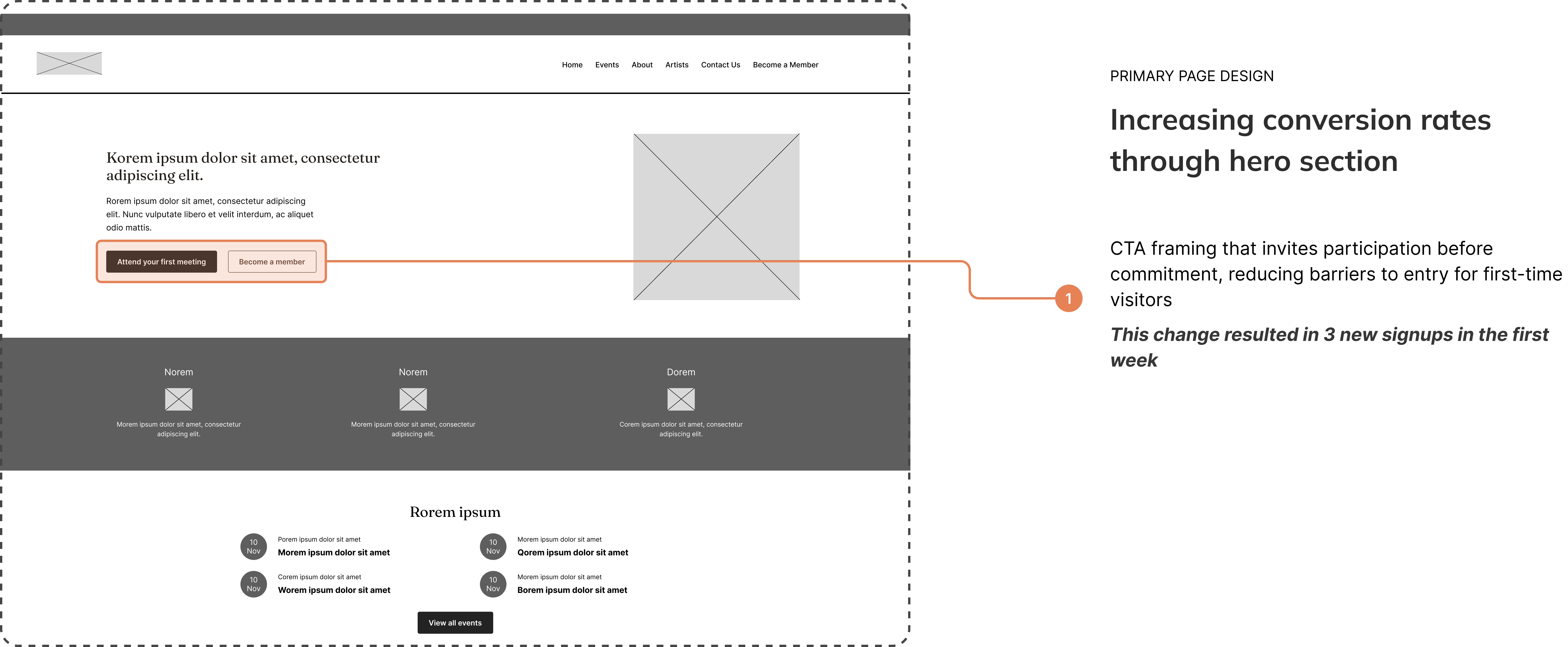
2. Progressive Disclosure
Pain Point
New visitors were often reluctant to become a member because they didn't know what to expect.
My Solution
I introduced a low-pressure entry point with dual CTAs: Attend a Free Meeting (primary) and Learn More (secondary), paired with community imagery to build trust and warmth before asking for commitment.

3. Simplified Information Architecture
Pain Point
The existing website made navigation confusing and used repeated pages
My Solution
I completely redesigned the site map to simplify navigation and streamline user flows
Research
Informing design decisions through stakeholder interviews and a site audit
Stakeholder Interviews
Unable to interview users directly due to time constraints, I turned to the internal stakeholders to better understand the needs and mental models of the users at hand and better inform my design decisions.
Key takeaway:Users are traditional artists seeking intuitive, low-friction information
BEHAVIOR
Users prefer simplicity to find the right information and complete specific tasks
DEMOGRAPHIC
Many are retirees or professionals in the later stages of their careers.
NEED
Because they aren't "digital natives," their primary needs revolve around clarity and reassurance
Key Insights
Prospective members were hesitant to join
New visitors wanted to observe the community before paying, but the site immediately pushed membership without context.
Content updates were a bottleneck
Board members needed to constantly update site content, but this process was often slow or inaccessible
Cumbersome IA
Site content often grew organically rather then systematically, making navigation confusing

SWS Member
"I was hesitant to join because I felt as a beginner watercolorist I wouldn't fit in."
Site Audit
I conducted an audit of the current website as a way to identify any critical usability issues, as well as prioritize key pages and features

Ideation
Designing a powerful and customizable website that's easy to navigate and maintain
User flows & information architecture
As part of the design process, it was important to establish a strong foundation for the website. This would eventually lead to simplified navigation and allow users to perform tasks much more easily.
Low-fidelity Wireframes
After creating sketches, I began iterating digital wireframes with the client to ensure stakeholder buy-in and to refine the UI elements.
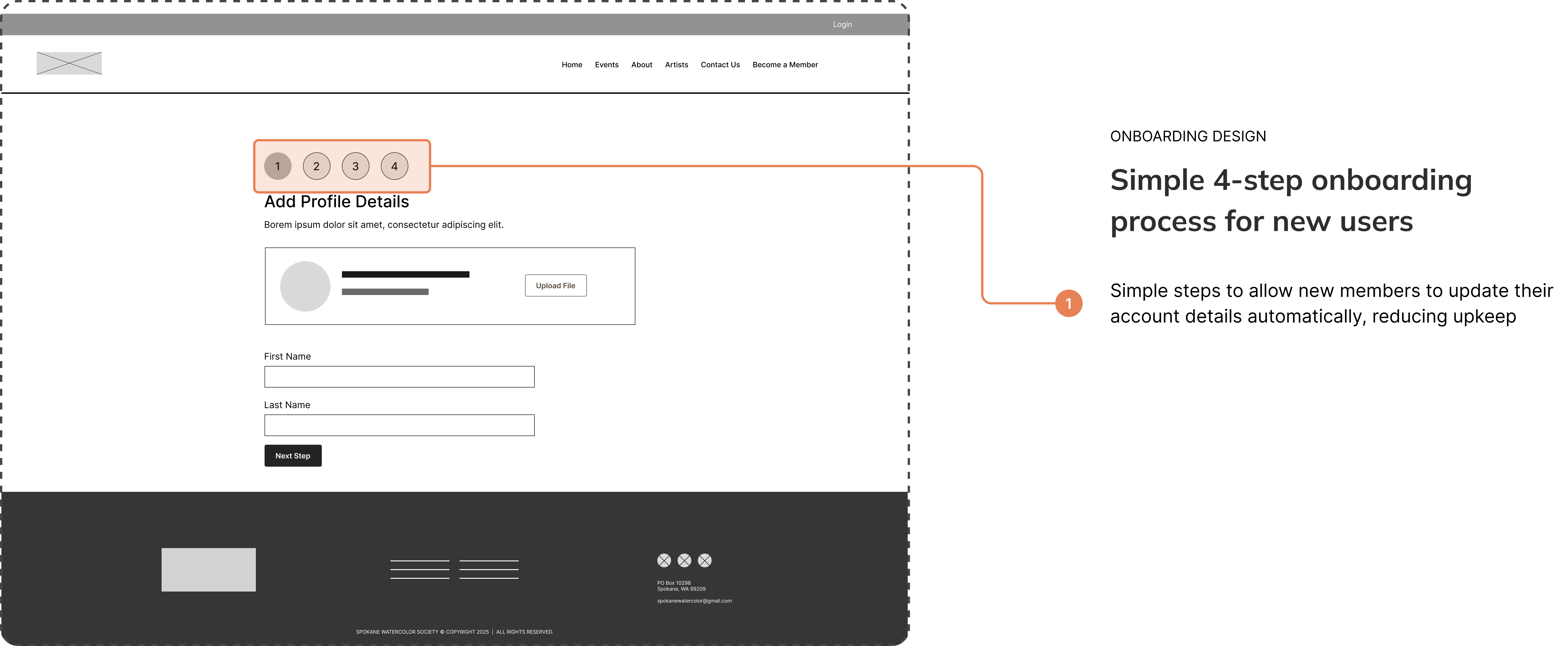
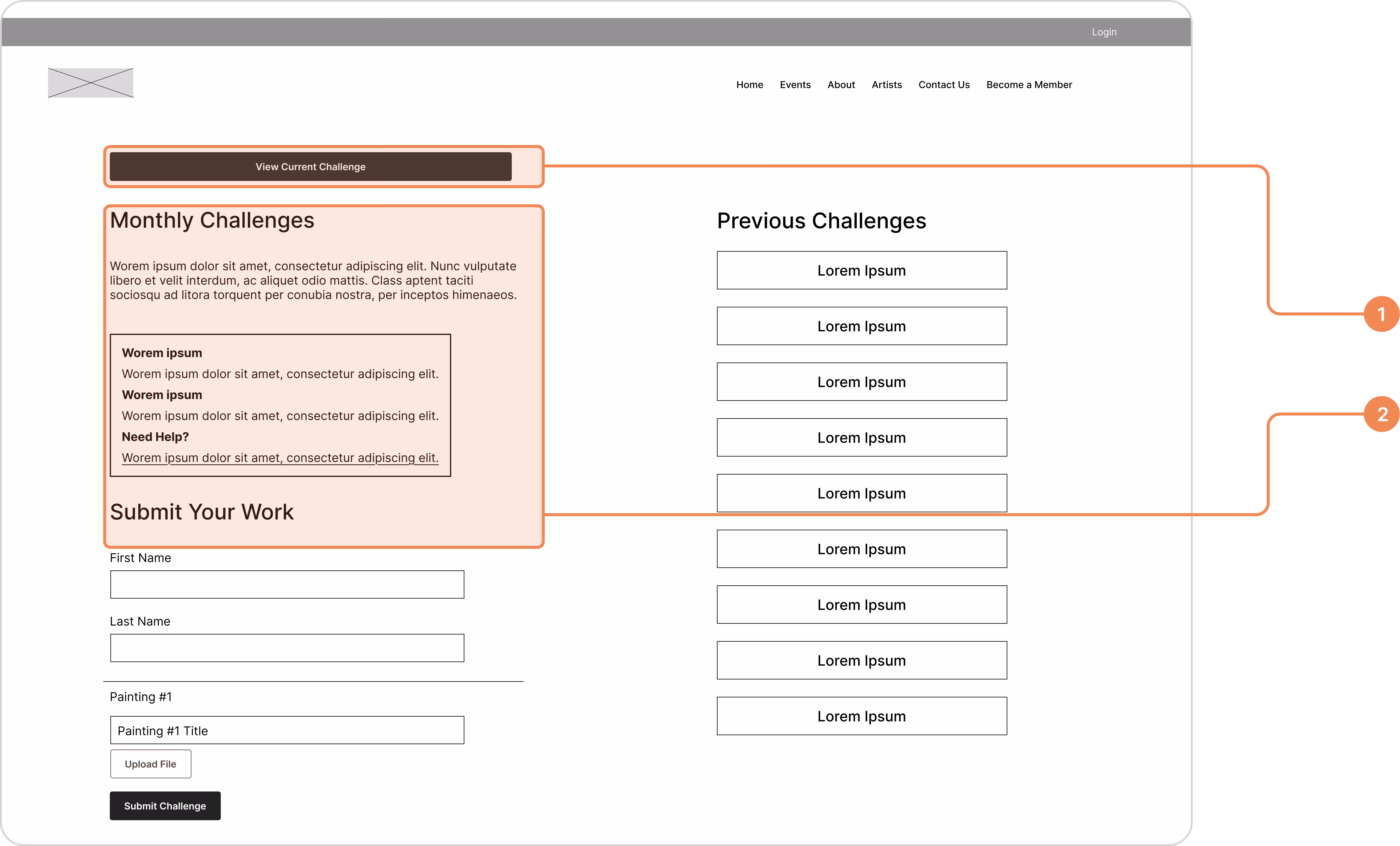
FORM DESIGN
Building form structures for effortless submissions
- Input section segmentation to reduce cognitive load and enhance form flow
- Seamless user flow for simple task completion
Feedback & Testing
Ideating and testing with the help of internal stakeholders and member through weekly client reviews
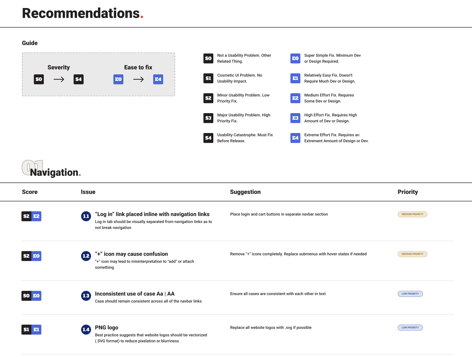
1. Affordance signals to communicate external links
BEFORE
A lack of affordance signals made it difficult to differentiate clickable elements.
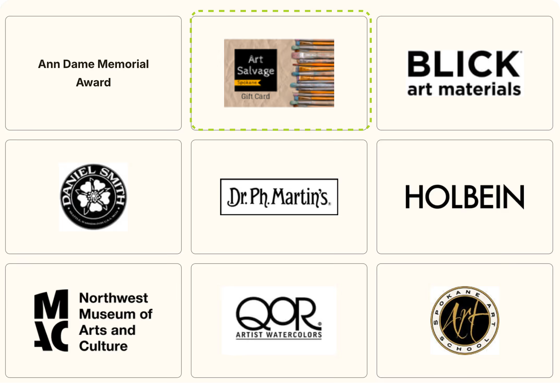
Added cognitive load
AFTER
Adding hover states and external link icons help users understand which elements are clickable.
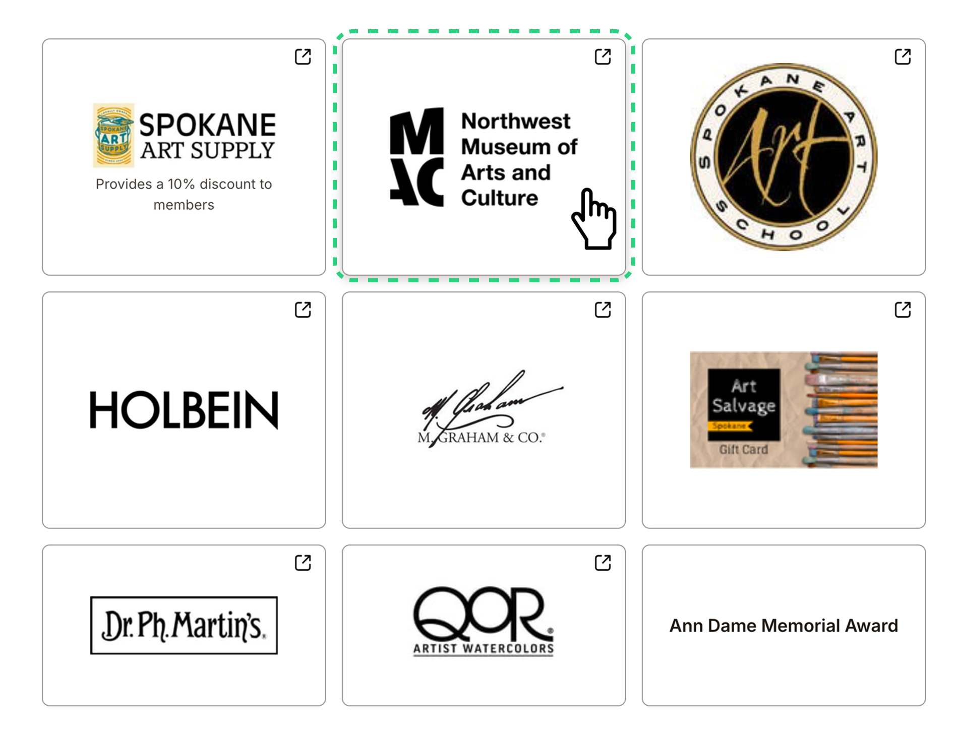
Increased system interaction
Faster scanning
2. Adding breadcrumbs for improved navigation and wayfinding
BEFORE
Testing revealed that navigation began to get difficult after 2 page levels deep.
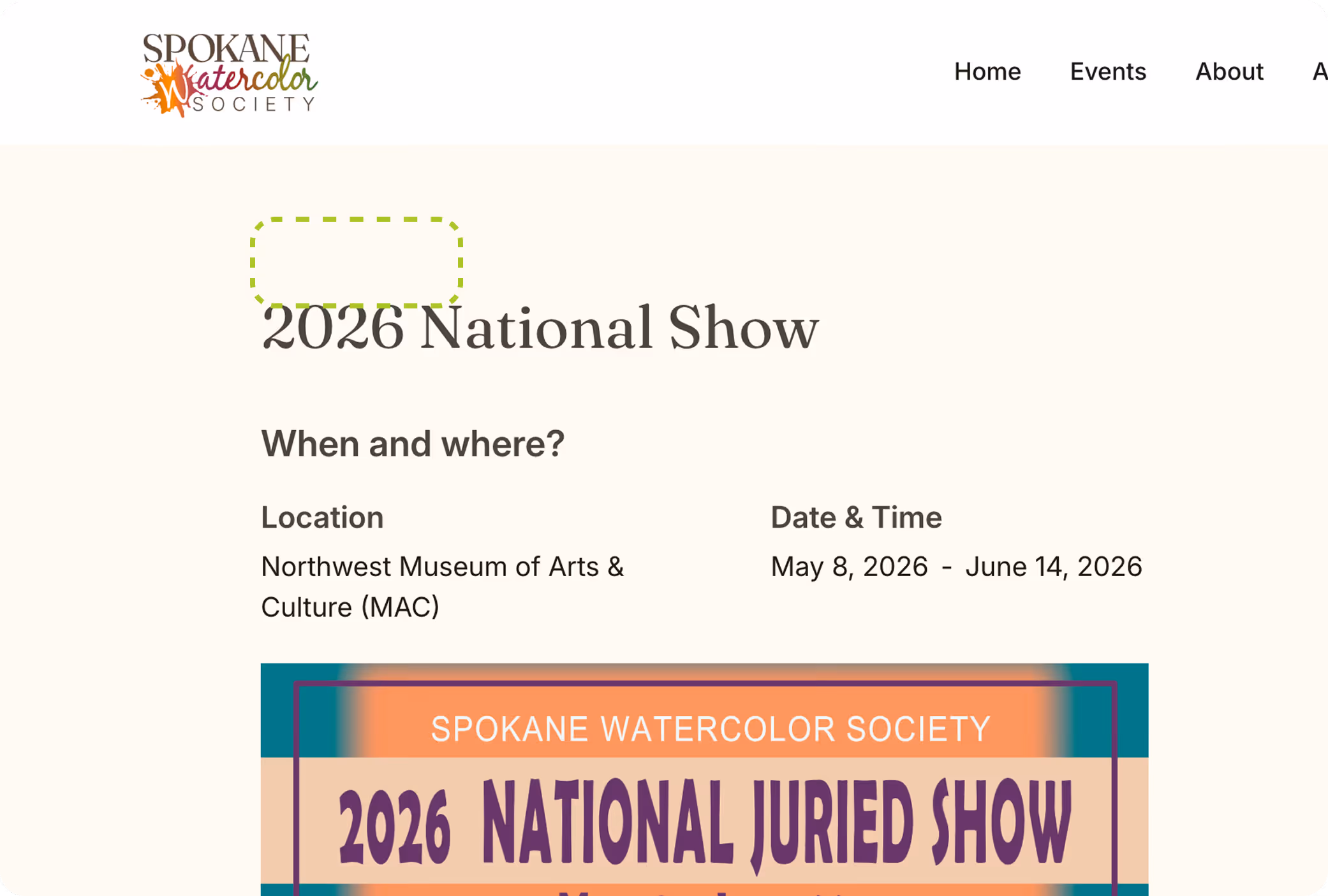
Navigation became confusing to users
AFTER
Adding breadcrumbs increased navigation clarity and allowed users to take shortcuts as needed.
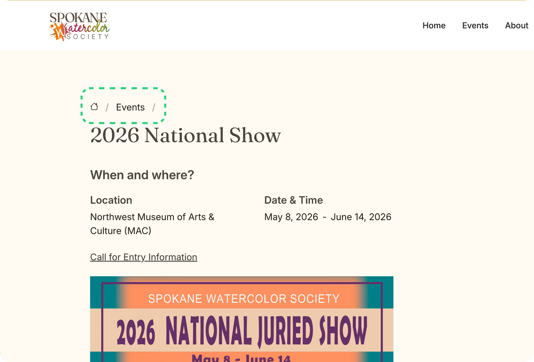
Improved wayfinding
Increased accessibility
Impact
+150% increase in new member sign-ups
month-over-month after launch
Client Feedback
“Our members love the new site and are raving about how easy it is to use."
Shipped Product
The redesigned website was successfully shipped in a 6 week timeline
Takeaways
Working 1:1 with clients
This project afforded me the wonderful opportunity to freelance directly with the client. I was able to learn and practice effective communication, training, and clear documentation to ensure a seamless project handoff as well as a high quality product.
Measure twice, cut once
Following a structured design process ensured organization and clarity at every stage for me. Moving from research to final development prevented rework and streamlined the transition to the live product.